Observations: Parameters of Technique
Pierre-Paul Prud'hon
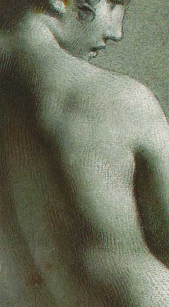
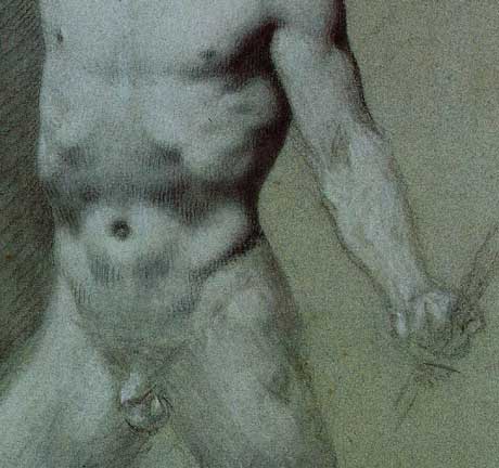
detail --Academie de femme debout
Charcoal, heightened with white chalk on blue paper
![]()
![]() Here,
I list a set of observations that begin to define Prud'hon's control over
his tonal language. Exceptions occur, but there is a pattern which is identifiable.
Here,
I list a set of observations that begin to define Prud'hon's control over
his tonal language. Exceptions occur, but there is a pattern which is identifiable.
On balance, white is used for the lit side, black for the shade;
and the blue paper, or blends of black and white, for halftones and low light.
Run parallel to each other and mostly run with the length or edge of the main form; but sometimes run obliquely to the main form, especially in shade.
list continues with next picture...

Lighting
Poses
That's enough to get us started...
![]()
![]()
![]()
![]() Next Page: Theory: Best Guess at Prud'hon's Step by Step Approach
Next Page: Theory: Best Guess at Prud'hon's Step by Step Approach
Rebecca Alzofon can be e-mailed
at rebecca@art.net
This page updated July 16, 2003
![]() 1999 by Rebecca Alzofon.
All rights reserved.
1999 by Rebecca Alzofon.
All rights reserved.