Discussion: Modern Materials
![]()
![]()
![]()
Discussion: Modern Materials
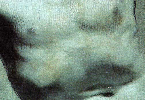
Pierre-Paul Prud'hon
detail --Academie
Charcoal, heightened with white chalk, on blue paper
middle value blue laid paper
It took some trouble to figure out what the necessary traits were for each element, and then to find modern products that were suitable and compatible with each other. The bottom line is, you need chalks that can freely smudge but also hold a point for a series of crisp lines. You need a toothy erasable paper that is medium value, laid, with a subtle blue color.
The Paper
Almost all commercially available laid drawing papers have over--or--under emphasized textures, poor chalk receptivity, and the wrong colors and/or values. Only three papers I found work. And, I must say, they work very well -- one is perfect for beginners, the other two, experts.
Expert/Gourmet
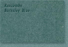
Ruscombe Paper Mill's Cotswold Colours, Laid
(UPDATED NOVEMBER 2001) I found these gorgeous handmade papers just a year after I mounted this online Prud'hon discussion. These papers were developed especially to replicate 18th and 19th century book papers for restorers, but are also specified for drawing. Finding them was like winning a time travel tour to 19th century France!
I immediately wanted to tell you about this paper, but unfortunately, by stocking my drawer with only 150 sheets, I exhausted the known supply in one fell swoop. The dealer told me that it was discontinued, but special orders in large quantities were possible -- at twice the price that I paid! The problem seemed insurmountable until 2001, when I contacted Chris Bingham, the maker of these wonderful papers. After showing Chris how I was using his paper, he offered to see to it that artists could still get their hands on it. (In late 2001, Chris visited the Louvre in Paris where he hand inspected several Prud'hon drawings. He pronounced that the match to his papers is uncanny!)
So, there IS hope for serious blue paper devotees. I am not part of the paper sales business, so please don't ask me to organize orders, but you won't be sorry if you get this paper. It is THE BEST, because it:
Find ordering details in the supply list.
Beginner
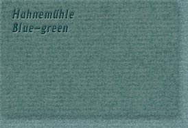
Hahnemuhle (German) Ingres
This is the first usable paper that I found, and it remains the ideal training sheet. Once you have mastered the basics of the technique on this paper, and if you can possibly afford it, switch to the gourmet version mentioned above.
This paper's color is a close match to the blue Prud'hon used, and it beats all the other similarly priced sheets, with its assorted combined attributes:
Find ordering details in the supply list.
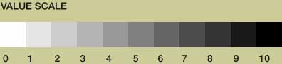
If you won't get the specified papers, make sure that the paper you do get is medium value, like between #'s 3 and 5, below. You can use gray paper with black and white chalks, but the resulting art will not carry the same cool moonlit feeling that Prud'hon got in his drawings. He and his contemporaries knew what they were doing. Correct?
This was the easiest to find. Conte makes two sticks that provide dense smudgeable white from one stick and crisp line from the other. I have not needed to look further for better results. See supply list.
This has been the problem. At first I used vine charcoal as well as medium and very soft black Conte sticks. However, their textures and color were not ideal (apparently Prud'hon did not even use charcoal). Conte sticks are marginally good, but I learned how to make better drawing sticks, myself. I'm including instructions for making them, so you can see what I mean.
Commercial blacks are not all at once intense, firm but fluid, and cold in color. Vine charcoal is fluid, but not dark enough to stand out against the medium value paper. The softest Conte black is dark enough, but for fine lines, it is too soft to keep sharp. The one-step-harder Conte makes crisp marks, but it's too hard to go down both gently and black. Last, there is a very unfortunate red cast in the rubbed out tones. I spent more time dancing around the problems with commercial blacks than I thought an artist should have to. Prud'hon's line work has a gentle freedom that is clearly different from what is possible with the commercial blacks. Prud'hon must have used less pressure to get his black lines. As far as the ugly red cast goes, this had to be present in the blacks of the 19th century, because it is the nature of these pigments to appear as the complement of this greenish blue paper. However, I decided to fix it at the same time I fixed the consistency of the sticks.
![]()
![]()
![]()
![]() Next Page: How to Make Your Own Better Black Chalks
Next Page: How to Make Your Own Better Black Chalks
What's New? | Shortcut
Entrances: | Studio -|
Alzofon Art Institute
-| Idea Library | Academy | Guest Wing |
Rebecca Alzofon can be e-mailed
at rebecca@art.net
This page updated July 16, 2003
![]() 1999 by Rebecca Alzofon.
All rights reserved.
1999 by Rebecca Alzofon.
All rights reserved.