
Observations: Parameters of Technique

Pierre-Paul Prud'hon
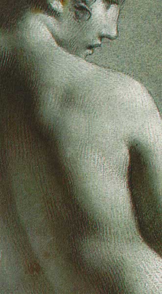
detail --Academie de femme debout
Charcoal, heightened with white chalk on blue paper
![]()
![]() Here,
I list a set of observations that begin to define Prud'hon's control over
his tonal language. Exceptions occur, but there is a pattern which is identifiable.
Here,
I list a set of observations that begin to define Prud'hon's control over
his tonal language. Exceptions occur, but there is a pattern which is identifiable.
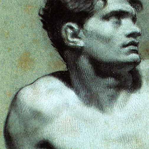
On balance, white is used for the lit side, black for the shade;
and the blue paper, or blends of black and white, for halftones and low light.
Smudged tones (mixtures of black and white) are seen in all areas of form, including halftones and low light.
Sparsely used fine white marks can be found in shade and the same can be found in the lit side with black.
Final black outline is used in varying widths, or not used at all (see below).
Stumping is extensively used.
Hatches
Run parallel to each other and mostly run with the length or edge of the main form; but sometimes run obliquely to the main form, especially in shade.
Are equally spaced
Are both straight and short in length
Are applied in row series across total form, but are ...
... organized separately over smaller anatomical form changes.
Only slightly interlock -- cross hatching rare in final stage
Underlying ghost hatches vary in direction from final top hatches
By direction, hatches show mirror symmetry in conformity with anatomical symmetry (see below)
Are commonly diagonal in background (see below)
Many areas of drawings are coarsely rendered, and these are often stumped
Torso is often most highly rendered
list continues with next picture...

Whites sometimes packed, saturated hatches found in large highlights
Blacks sometimes solidly blended, and obscure signs of hatching

Lighting
Single, artificial point light source was aimed at the model, clarifying volumes and simplifying transitions between light and shade.
Artist must have worked in darkened room. White chalk sparkles even in dim light; by contrast, the paper and blacks absorb dim light. Dramatic volumes can be perceived with delicate additions of white in dimly lit rooms. But in strong light, this effect is degraded. If you draw in a strongly lit room, you will not perceive impressive variations from the sparkling whites, and your drawing will probably come out crude -- possibly making the flesh look oily from heavy highlights.
Poses
Poses are harmoniously arranged in stepped elevations, or suggestive of motion.
Faces are made unselfconscious.
That's enough to get us started...
![]()
![]()
![]()
![]() Next Page: Theory: Best Guess at Prud'hon's Step by Step Approach
Next Page: Theory: Best Guess at Prud'hon's Step by Step Approach
Rebecca Alzofon can be e-mailed
at rebecca@art.net
This page updated July 16, 2003
![]() 1999 by Rebecca Alzofon.
All rights reserved.
1999 by Rebecca Alzofon.
All rights reserved.