From: "Drew Olbrich" <drew@pdi.com>
Date: Sat, 21 Dec 1996 19:43:26 -0800
Subject: IRIX 6.x audio panel

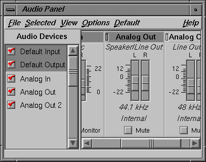
Oh please, could the new SGI audio panel possibly be more overengineered and awkward? It's like this weird Frankenstein panel with strange prosthetic limbs protruding from every orifice, hindering basic bodily functions like breathing and eating and watching TV.
What's up with the whole "multiple widget-laden panels in a subwindow with a scrollbar so you can scroll around between the panels because the main window isn't big enough" cuteness? Why do people think this is so cool? It's like the audio balance widgets are a little document! I though the old "MultiTrack" program was supplied by SGI as a proof that this kind of user interface metaphor was mistake and should not be repeated.
If it's so useful, why isn't it just built into the window manager? Every high-level window could have its own set of goofy scrollbars for scrolling around inside a larger virtual window.
I know, the window manager could provide every high-level window with its own built-in multipage virtual desktop! This could be a standard feature. (I am just kidding, haha!)
The most shocking weirdness of the audio panel appears when you start the program up. The scrolling panels, menu bars and status line all perform this bizarre little Vulcan dance ritual as they satisfy their position and size constraints, hopping about wildly until they eventually settle down. I'm not sure if the author's intent here with this "constraing jig" is to impress me or to drive me into a psychotic rage.
Hey -- if all the new machines all have 8 bit overlay planes, why are the pulldown menus still being displayed in the normal planes, causing all sorts of flickering spooge in an application's main window area? Are there applications floating around out there that need to put 24 bit images in the pulldown menus?
Drew